More people access websites through smartphones and tablets than ever before. Whether visitors are researching a service, reading a blog, comparing products, or making an online purchase, they expect websites to work smoothly on their devices. A website designed only for desktop screens can create frustrating experiences for mobile users.
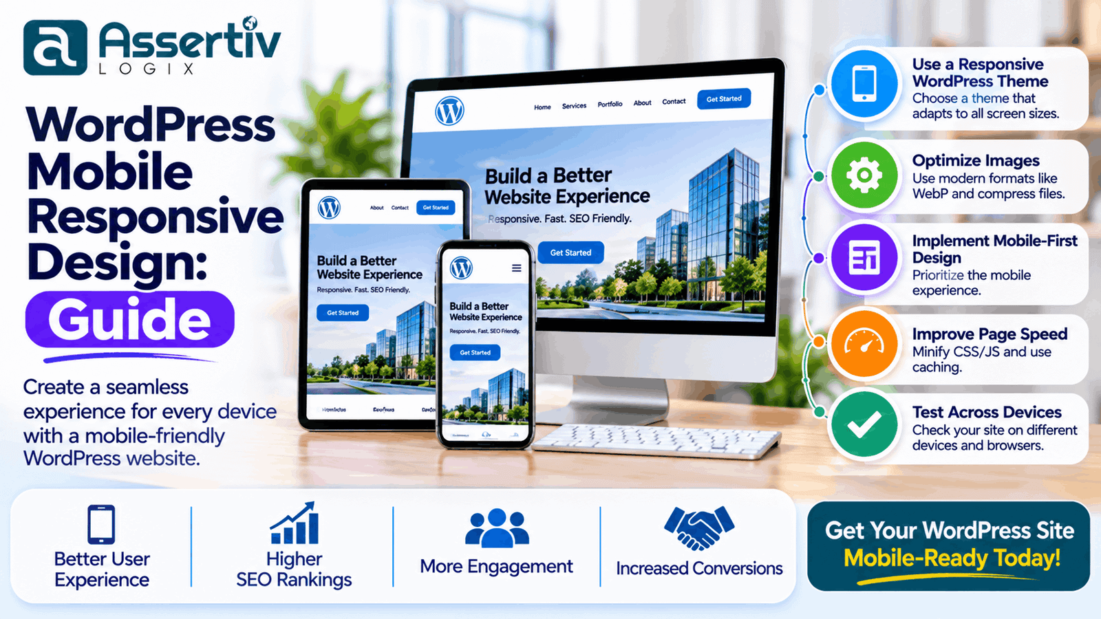
WordPress mobile responsive design helps websites adapt to different screen sizes, resolutions, and device orientations. It ensures that content, images, navigation, forms, and interactive elements remain usable across smartphones, tablets, laptops, and desktop computers.
However, responsive design involves more than shrinking a desktop layout to fit a smaller screen. It requires thoughtful layout planning, readable typography, touch-friendly controls, optimized images, and consistent performance.
In this guide, we explain how responsive design works in WordPress, why it matters, and how to build a mobile-friendly website using practical design and development techniques.
What Is WordPress Mobile Responsive Design?
WordPress mobile responsive design is the process of creating a website that automatically adjusts its layout and presentation to suit different screen sizes and devices.
A responsive website uses flexible layouts, scalable images, CSS media queries, and adaptable components to provide a consistent experience across devices.
For example:
- A desktop navigation menu may become a compact mobile menu.
- A three-column service layout may become a single-column layout on smartphones.
- Large images may scale to fit the available screen width.
- Typography and spacing may adjust for better readability.
- Buttons and links may become easier to tap.
- Tables and complex content may use mobile-friendly layouts.
WordPress supports responsive websites through themes, block layouts, CSS, and custom development. The final result depends on how the website is designed and implemented.
Why Is Mobile Responsive Design Important for WordPress Websites?
A responsive website helps businesses serve visitors who use different devices. It also supports accessibility, usability, and search engine optimization.
1. Better mobile user experience
Visitors should be able to read content, navigate menus, interact with forms, and explore services without constantly zooming or scrolling horizontally. Responsive layouts make these activities more convenient.
2. Mobile-first indexing
Google primarily uses the mobile version of a website’s content for indexing and ranking. This makes it important to ensure that the mobile version contains the important content, links, metadata, and structured information available on the desktop version.
3. Improved conversion opportunities
Mobile visitors may want to call a business, submit an enquiry, purchase a product, or book a service. Clear layouts, readable text, and easy-to-use buttons help them complete these actions.
4. Consistent brand presentation
Responsive design helps maintain consistent branding, typography, colours, and visual identity across different devices.
5. Easier website management
A properly responsive website generally allows businesses to manage one website that adapts to different devices instead of maintaining separate desktop and mobile versions.
Responsive Design vs Mobile-Friendly Design
These terms are often used interchangeably, but they describe slightly different ideas.
| Factor | Responsive Design | Mobile-Friendly Design |
|---|---|---|
| Layout | Adapts dynamically to different screen sizes | Provides a usable experience on mobile devices |
| Screen sizes | Designed for a range of viewport widths | Focuses on making mobile access convenient |
| Navigation | Can change based on available screen space | Should be easy to use on mobile |
| Images | Can scale and use responsive image sources | Should fit the mobile screen and load efficiently |
| Implementation | Flexible grids, CSS, media queries, and adaptable components | Usability improvements and mobile-specific adjustments |
Responsive design is a common way to achieve a mobile-friendly experience. A website can appear usable on a phone while still having responsive design problems on intermediate screen sizes or tablet layouts.
Key Elements of a Responsive WordPress Website
A well-designed responsive WordPress website combines several elements that work together.
1. Flexible layouts
Layouts should adapt to available screen space instead of relying on fixed desktop dimensions. CSS Grid, Flexbox, percentages, and suitable maximum widths can help create flexible page structures.
2. Responsive images
Images should scale within their containers and use appropriate image sizes for different devices. WordPress supports responsive image attributes such as srcset and sizes for eligible images.
3. Readable typography
Text should remain comfortable to read without requiring users to zoom. Use appropriate font sizes, line heights, contrast, and spacing across screen sizes.
4. Mobile-friendly navigation
Menus should be easy to open, understand, and navigate with touch input. Avoid overcrowded navigation bars and ensure that dropdowns work reliably on mobile devices.
5. Touch-friendly buttons and controls
Links, buttons, form controls, and interactive elements should have enough space to be selected accurately. Avoid placing important controls too close together.
6. Flexible content sections
Sidebars, cards, testimonials, pricing tables, and feature sections should reorganize appropriately on smaller screens. The layout should prioritize the most important information.
How to Make a WordPress Website Mobile Responsive
There are several ways to build or improve a responsive WordPress website. The right approach depends on the theme, page builder, existing design, and level of customization required.
1. Choose a responsive WordPress theme
Start with a theme designed to support different screen sizes. Check its mobile navigation, typography, page templates, image behavior, and layout flexibility.
Before selecting a theme:
- Preview its homepage and inner pages on mobile devices.
- Check whether menus and dropdowns work properly.
- Review how service sections and cards stack on smaller screens.
- Check image scaling and spacing.
- Test the theme with the plugins your website requires.
- Review code quality, updates, and compatibility.
A responsive theme provides a starting point, but individual pages and third-party components still need testing.
2. Use a mobile-first design approach
Mobile-first design starts with the smallest supported screen and progressively enhances the layout for larger devices.
This approach encourages developers to prioritize essential content and functionality rather than trying to fit every desktop element onto a small screen.
A practical mobile-first workflow includes:
- Identify the most important content and actions.
- Design a clear single-column mobile layout.
- Establish readable typography and comfortable spacing.
- Add navigation and interactive components.
- Expand the layout for tablet and desktop screens.
- Test the design at intermediate screen widths.
3. Configure the viewport
The viewport meta tag helps browsers display a page according to the device’s screen width.
A common configuration is:
<meta name="viewport" content="width=device-width, initial-scale=1">Most modern WordPress themes already include viewport configuration. If you are developing a custom theme, ensure that the document head contains an appropriate viewport declaration.
4. Use CSS media queries
CSS media queries allow developers to apply different styles based on viewport characteristics such as width and orientation.
For example, a desktop layout may use three columns, while smaller screens display the same content in one column.
/* Flexible service grid */
.service-grid {
    display: grid;
    grid-template-columns: repeat(3, minmax(0, 1fr));
    gap: 24px;
}

/* Tablet layout */
@media (max-width: 991px) {
    .service-grid {
        grid-template-columns: repeat(2, minmax(0, 1fr));
    }
}

/* Mobile layout */
@media (max-width: 600px) {
    .service-grid {
        grid-template-columns: 1fr;
        gap: 16px;
    }
}
These breakpoints are examples, not universal standards. Choose breakpoints based on where your actual content and layout need adjustment.
5. Use flexible images and media
Images and videos should not overflow their containers or force horizontal scrolling.
img,
video {
    max-width: 100%;
    height: auto;
}
For background images, check how the image crops at different viewport widths. A background that looks good on a desktop screen may hide important content on a phone.
6. Optimize mobile navigation
Navigation is one of the most important parts of a mobile website. Visitors should be able to find important pages without struggling with small links or complicated dropdowns.
Recommended practices include:
- Use a clearly visible menu control.
- Keep the navigation structure simple.
- Provide enough spacing between menu items.
- Ensure dropdowns work with touch and keyboard input.
- Make the menu easy to close.
- Keep important contact or enquiry actions accessible.
7. Make forms mobile-friendly
Long or difficult forms can discourage mobile visitors from submitting enquiries.
Improve form usability by:
- Using clearly visible labels.
- Keeping fields full-width where appropriate.
- Using suitable input types for email, telephone, and numbers.
- Providing readable validation messages.
- Reducing unnecessary form fields.
- Ensuring buttons are easy to tap.
- Testing the keyboard and autocomplete experience.
How to Make Elementor Websites Responsive
Elementor provides responsive editing controls that allow designers to adjust layouts and styles for different device sizes. It can be useful for building responsive WordPress websites without writing every layout rule manually.
When working with Elementor:
- Use its responsive preview to inspect desktop, tablet, and mobile layouts.
- Adjust column direction and width for smaller screens.
- Set suitable typography and spacing for each device size.
- Check image positioning and cropping.
- Review section and container padding.
- Hide elements only when doing so does not remove important content or functionality.
- Test menus, popups, forms, and interactive widgets on actual devices.
Responsive controls do not automatically guarantee a good mobile experience. Complex layouts, custom CSS, third-party widgets, and plugin output may require additional adjustments.
For websites with extensive custom requirements, developers can combine Elementor with custom CSS, PHP, JavaScript, and WordPress functionality.
Mobile Responsive Design Best Practices
Follow these practices when creating or improving a responsive WordPress website.
Prioritize important content
Show the most relevant information first. Mobile visitors should not have to scroll through excessive decorative content to find a service description, product detail, or contact action.
Maintain readable font sizes
Choose typography that remains readable on smaller screens. Use flexible sizing carefully and test actual text at common viewport widths.
Avoid horizontal scrolling
Page content should fit the available viewport width. Check wide tables, code blocks, navigation menus, images, and embedded content for overflow.
Use consistent spacing
Responsive spacing should keep content organized without wasting valuable mobile screen space. Avoid excessively large padding and margins on small devices.
Optimize media assets
Use appropriately sized images, modern formats where supported, and efficient video embeds. Avoid automatically downloading large desktop assets on every mobile visit.
Maintain accessibility
Use semantic HTML, visible focus states, keyboard-accessible menus, descriptive labels, sufficient contrast, and meaningful alternative text for informative images.
Test real user journeys
Do not test only the homepage. Check service enquiries, contact forms, product filters, shopping carts, account pages, and checkout flows on mobile devices.
Mobile Performance and Core Web Vitals
Responsive design and performance work together. A website may fit a mobile screen correctly but still feel slow because of oversized images, render-blocking resources, or heavy JavaScript.
Google’s Core Web Vitals provide useful metrics for assessing loading, responsiveness, and visual stability.
| Metric | What It Measures | Good Target |
|---|---|---|
| Largest Contentful Paint (LCP) | Loading performance of the largest visible content element | 2.5 seconds or less |
| Interaction to Next Paint (INP) | Responsiveness to user interactions | 200 milliseconds or less |
| Cumulative Layout Shift (CLS) | Unexpected layout movement | 0.1 or less |
To improve mobile performance:
- Optimize the main visible image.
- Reduce unnecessary CSS and JavaScript.
- Use suitable caching and hosting.
- Reduce third-party scripts where possible.
- Prevent unexpected layout shifts.
- Use responsive image delivery.
- Test performance on mobile network conditions.
Read our WordPress Performance Optimization Guide for more detailed techniques.
Common WordPress Mobile Responsive Design Mistakes
Even websites built with responsive themes can have mobile usability problems. Watch for these common issues:
- Designing only for desktop: A desktop-first layout may become difficult to use on smaller screens.
- Using fixed widths: Fixed-width containers can overflow narrow viewports.
- Using text that is too small: Visitors may need to zoom to read important content.
- Creating crowded navigation: Too many links can make menus difficult to use.
- Using oversized images: Large assets can increase mobile loading times.
- Ignoring tablet layouts: A layout may work on phones and desktops but break at intermediate widths.
- Hiding important content: Removing essential information on mobile can create inconsistent experiences.
- Ignoring touch interactions: Small controls and closely spaced links are difficult to select accurately.
- Skipping device testing: Browser previews alone may not reveal every real-world issue.
How to Test WordPress Mobile Responsiveness
Testing helps identify layout and usability problems before visitors encounter them.
1. Chrome DevTools
Chrome DevTools includes device emulation that lets developers preview a website at different viewport sizes. It is useful for checking layout changes, breakpoints, and overflow issues.
2. Google PageSpeed Insights
Google PageSpeed Insights provides mobile and desktop performance assessments, along with optimization recommendations.
3. Google Search Console
Google Search Console helps monitor indexing and Core Web Vitals data. It can help identify performance problems affecting groups of URLs.
4. Real device testing
Test the website on actual smartphones and tablets when possible. Check touch interactions, scrolling, forms, menus, image cropping, and page loading over different network conditions.
5. Test important page templates
Inspect more than the homepage. Test blog posts, service pages, contact pages, product listings, product details, cart pages, and checkout pages where relevant.
Responsive Design for WooCommerce Websites
WooCommerce websites need special attention because visitors use product filters, galleries, cart controls, account pages, and checkout forms.
Recommended practices include:
- Use product grids that adapt to smaller screens.
- Make product images and galleries fit the viewport.
- Keep product titles, prices, and purchase buttons readable.
- Ensure filters and sorting controls are easy to access.
- Make cart quantity controls touch-friendly.
- Use mobile-friendly checkout fields.
- Keep payment and shipping information clear.
- Test the complete purchase journey on smartphones.
Explore Assertivlogix WooCommerce Development Services for responsive online store development and customization.
When Should You Hire a WordPress Responsive Design Expert?
Many responsive improvements can be handled through theme settings or page builder controls. However, complex websites may require custom development to achieve a consistent experience across devices.
Consider professional support when:
- Your website layout breaks on specific screen sizes.
- Mobile navigation or dropdown menus do not work correctly.
- Custom pages need responsive redesign.
- Elementor layouts require advanced CSS adjustments.
- WooCommerce product and checkout pages are difficult to use on mobile.
- Your website has mobile performance problems.
- You need a custom responsive WordPress theme.
- You are planning a website redesign or migration.
WordPress Responsive Website Development by Assertivlogix
At Assertivlogix, we develop custom WordPress websites with a focus on usability, responsive layouts, performance, and maintainability.
We help businesses create websites that provide consistent experiences across smartphones, tablets, laptops, and desktop screens.
Our WordPress development services include:
- Custom responsive WordPress theme development
- Mobile-friendly website redesign
- Elementor responsive layout customization
- Responsive WooCommerce development
- Custom CSS and front-end development
- Mobile performance optimization
- Website testing and quality assurance
- Ongoing WordPress maintenance and support
Let our team create a mobile-friendly website that looks professional and works smoothly across different devices.
Frequently Asked Questions
1. What is responsive design in WordPress?
Responsive design in WordPress means creating a website that adapts its layout, images, typography, and navigation to different screen sizes. It helps visitors use the website across smartphones, tablets, laptops, and desktop computers.
2. How do I make my WordPress website mobile-friendly?
Use a responsive theme, adopt a mobile-first layout, optimize images, configure flexible CSS layouts, simplify navigation, and test important pages on different screen sizes and real devices.
3. Is WordPress automatically mobile responsive?
WordPress itself does not automatically make every website responsive. Responsiveness depends on the theme, templates, page builder, custom CSS, plugins, and how individual pages are developed.
4. Is Elementor good for responsive WordPress design?
Yes. Elementor includes responsive editing controls for adjusting layouts and styling across device sizes. Complex layouts and third-party widgets may still require additional CSS or custom development.
5. Does responsive design improve SEO?
Responsive design supports mobile usability and helps provide consistent content across devices. Google primarily uses the mobile version of a website for indexing, so important content and links should remain available on mobile.
6. How can I test whether my WordPress website is mobile responsive?
Use Chrome DevTools to inspect different viewport sizes, Google PageSpeed Insights to review mobile performance, and real smartphones and tablets to test navigation, forms, images, and interactions.
7. What is the difference between mobile-first and responsive design?
Mobile-first is a design approach that starts with smaller screens and progressively enhances the layout for larger devices. Responsive design is the implementation approach that allows the layout to adapt to different screen sizes. They are commonly used together.
8. Can an existing WordPress website be converted into a responsive website?
Yes. An existing website can be updated with responsive CSS, theme improvements, page template changes, or a custom redesign. The best approach depends on the current theme, page structure, and functionality.